When it comes to design, a well-decorated home is not just about pretty furniture or lighting, it all starts with colour. The colours you select affect the atmosphere, energy and visual balance of your space. Your flat in London needs you to renovate it, your villa in the suburbs deserves a makeover — any room can get an elevated vibe with the right colour palette, which can also alter your home’s entire personality.
But how do you choose what’s best for your space with thousands of paint chips and an endless scroll of Pinterest boards? This guide will help you decide on colours that express your personality, complement your layout, and create a coherent, great-designed home— whether you’re working on bedroom interior design, refreshing your living room interior or hiring an interior design company to help you out.
The Importance of a Colour Palette — Why You Should Get Your Home’s Colour Palette Right First
But before you reach for a paintbrush, bear in mind one thing: colour plays a role in everything. From how wide a room feels to how welcoming it is, the palette you choose can either enhance your space or sabotage it. And a solid scheme provides cohesion and flow, linking one room to the next in a way that seems organic and deliberate.
This choice also sets the stage for other design decisions — furniture selection, fabric choices, flooring, artwork and even lighting. As a bedroom interior design expert, the first thing we look at is colour. A balanced colour palette can also help plan a harmonious space in the living room, where comfort, conversation and relaxation meet.
Not sure where to begin? A reputable interior design company can bring colour psychology, the impact of natural light, and trending tones — all adjusted to your space.
A Guide to Choosing the Ideal Colour Palette for Each Room
Step 1: Decide What Mood You Want to Set
Use colours to reflect the purpose of each room. Consider what mood you’re trying to create:
- Calm and restful: Best for bedrooms—choose soft neutrals, pastels and cool shades like blue, lavender or sage green. Perfect for tranquil bedroom interior design.
- Energetic and social: Ideal for kitchens or family rooms—try warm tones such as terracotta, mustard, coral or sunny yellows.
- Indulgent and theatrical: Ideal for dining rooms or show-stopping corridors—deep jewel colors such as emerald, navy or charcoal add dimension and sophistication.
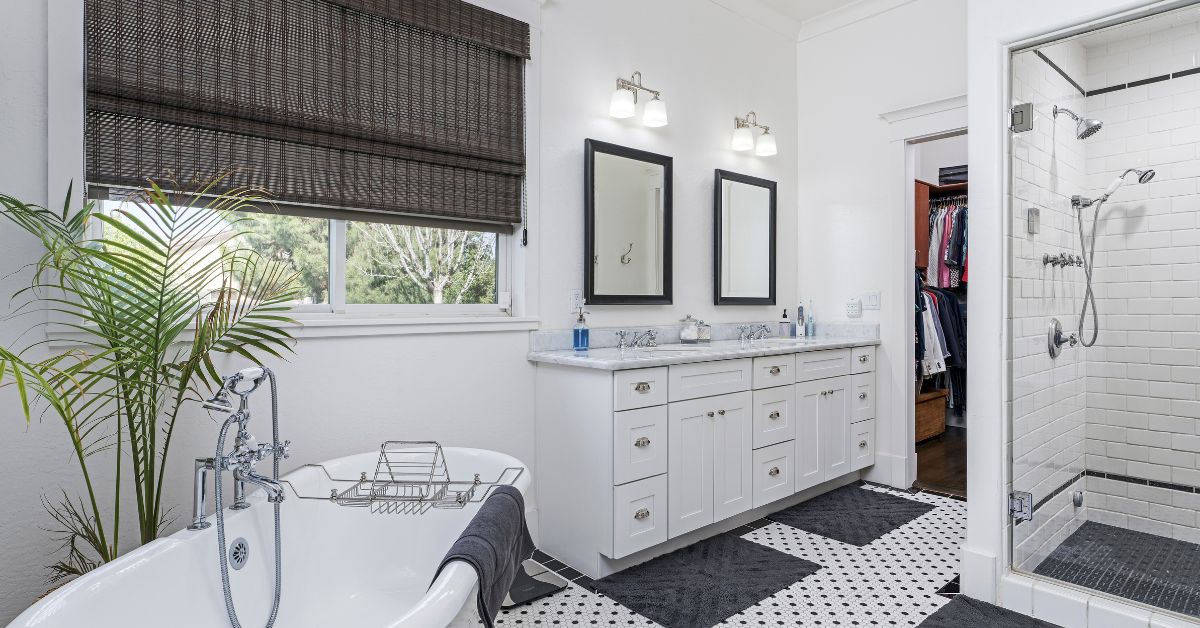
- Balanced and welcoming: Perfect for your lounge or open spaces—Greys, beiges and warm whites work wonders in living room interior design, particularly when layered with textures.
Step 2: Starting with a Base Colour
Your base colour is your “anchor” for the whole palette. Typically a light or neutral hue used for walls or larger pieces of furniture. Pick a universal colour that works as a backdrop — something you won’t grow tired of quickly.
Some reliable base options:
- Soft grey
- Warm white
- Cream
- Taupe
- Light beige
From here, establish supporting colours using the 60-30-10 rule:
- 60%: Dominant colour (walls/bigger furniture)
- 30%: Secondary colour (rugs, curtains, accent furniture)
- 10% : Accent colour (cushions, artwork, accessories)
This keeps your room balanced and avoids visual overload.
Step 3: Getting Guidance from the Colour Wheel
If you’re unsure about which colours will work together, use the colour wheel to guide you:
- Monochromatic: Tones from a single colour family—perfect for achieving a clean, minimalist aesthetic.
- Analogous: Colours next to each other on the wheel. These combos work great in expressive but unified living room interior design.
- Complementary: Colours opposite on the wheel create bold contrasts. Use sparingly for impact.
Professionals often use these principles to create spaces that feel cohesive, balanced, and intentional.
Step 4: Consider the Natural and Artificial Lighting
Lighting plays a big role in how colours appear. A grey shade might seem blue in one room and taupe in another, depending on the light source.
- Natural Light: South-facing rooms receive warmer tones, which pair well with cool colours. North-facing spaces are dimmer, so warmer hues work better.
- Artificial Light: Warm bulbs give colours a yellow or orange tint, while cooler bulbs bring out blues and greens.
Before committing, paint large swatches on your walls and observe them at different times of the day to see how the colour shifts.
Step 5: Use What You Already Own as Inspiration
Draw from items you love—art, rugs, clothing—to build your colour scheme. Choose a few shades from a favorite item and use those throughout the space for a personalized, cohesive look.
In a main gathering area, for example, pulling colours from a bold pillow or a standout piece of art can help you create a natural flow.
Step 6: Don’t Forget Ceilings and Trim
People often default to white for ceilings and trim, but these areas can offer a great chance for contrast. A soft grey ceiling in a white room adds depth, or try matching the trim to the wall for a seamless, modern finish.
Adding darker tones on mouldings can help ground a space, especially in open layouts.
Step 7: Test, Test, Test
Always sample your paint first. Try a few colours directly on your wall in large patches, and keep them up for a few days. Check how they interact with your furniture, flooring, and natural light.
What looks good in the can might look completely different once applied.
Step 8: Keep It Cohesive Across the Home
Each room can have its own identity, but using a consistent palette throughout creates flow. Repeating shades or using complementary colours can help unify the entire space.
A hallway painted in a soft green can transition beautifully into a deeper olive in the next room and a muted sage elsewhere, making the home feel visually connected.
Step 9: Trends vs. Timelessness
Trends are fun, but they change quickly. Use trendy shades for accents—like pillows, accessories, or a feature wall—so they’re easy to swap out.
Stick to timeless base colours—like creams, greys, and earthy greens—for the main palette to ensure longevity and flexibility.
Step 10: Call in the Pros (If Needed)
If you’re struggling with colour choices or working with a challenging space (like low light or unusual architecture), it’s worth getting expert input. They can help tailor colour recommendations to your space and provide tools like mood boards and swatches.
Their insight often goes beyond colour alone, factoring in layout, usage, and future furnishings.
Final Thoughts
Choosing colours isn’t just about picking your favourites—it’s about how they make you feel, how they interact with your surroundings, and how well they support your lifestyle. Whether you’re going for a peaceful vibe or a more vibrant, stylish atmosphere, colour plays a powerful role in shaping the character of your home.
With thoughtful planning, a bit of creativity, and inspiration tailored to your space, you can transform any area into something truly beautiful, functional, and unmistakably yours.